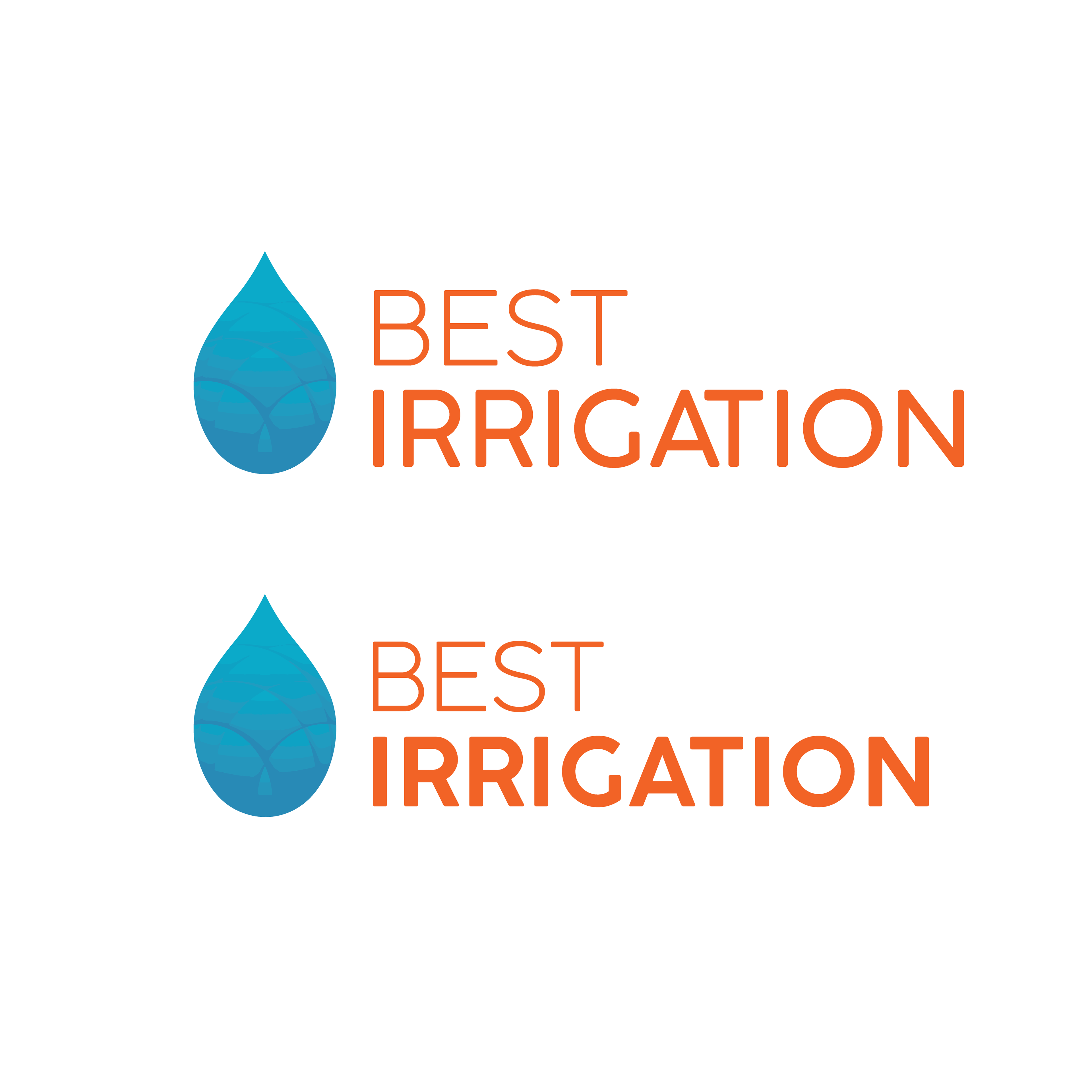
This logo was designed for an irrigation company specializing in lawn maintenance and installation of irrigation systems. The objective of the design was to represent the irrigation aspect of the company with the water drop icon while also incorporating the land aspect with the grid left by the lawn cut.

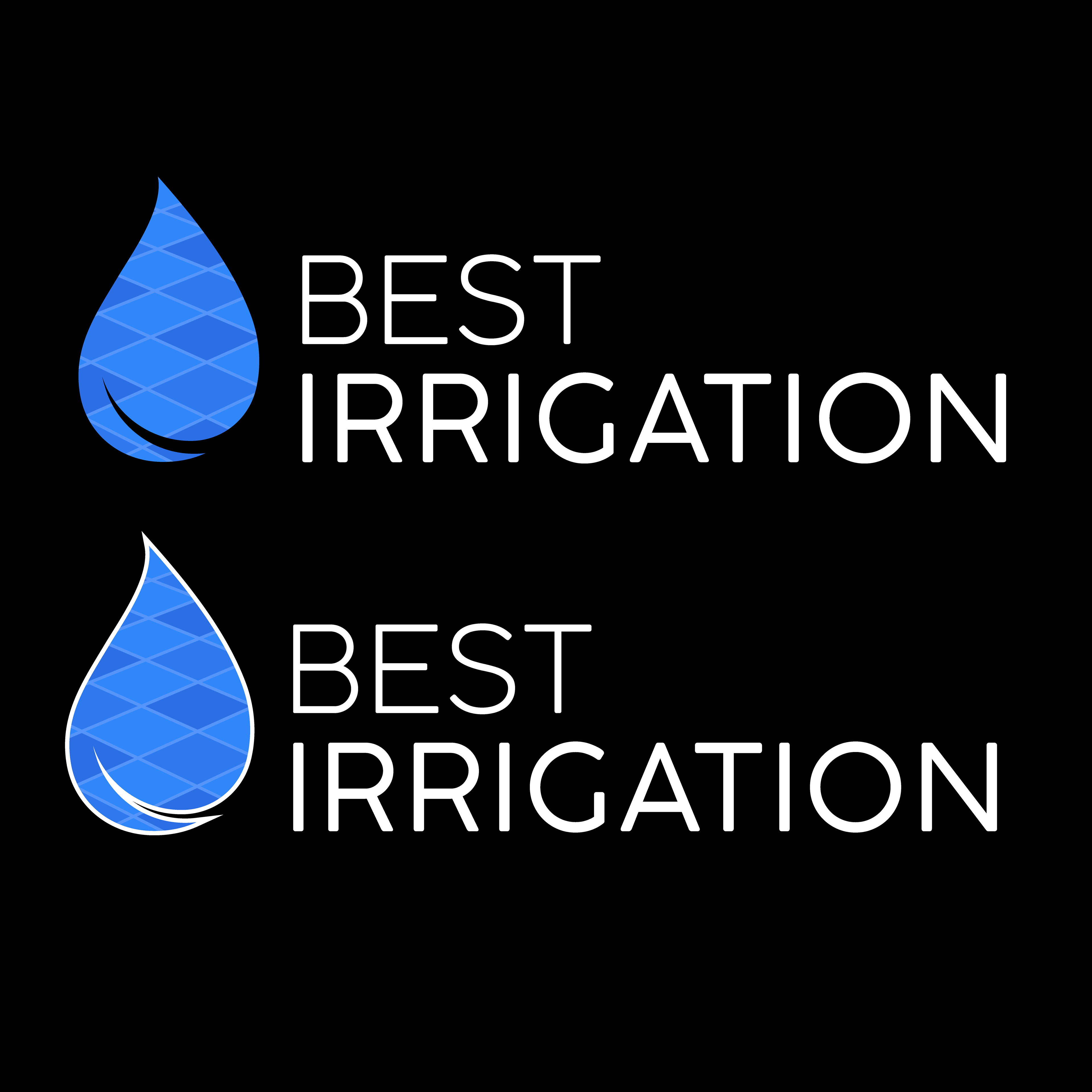
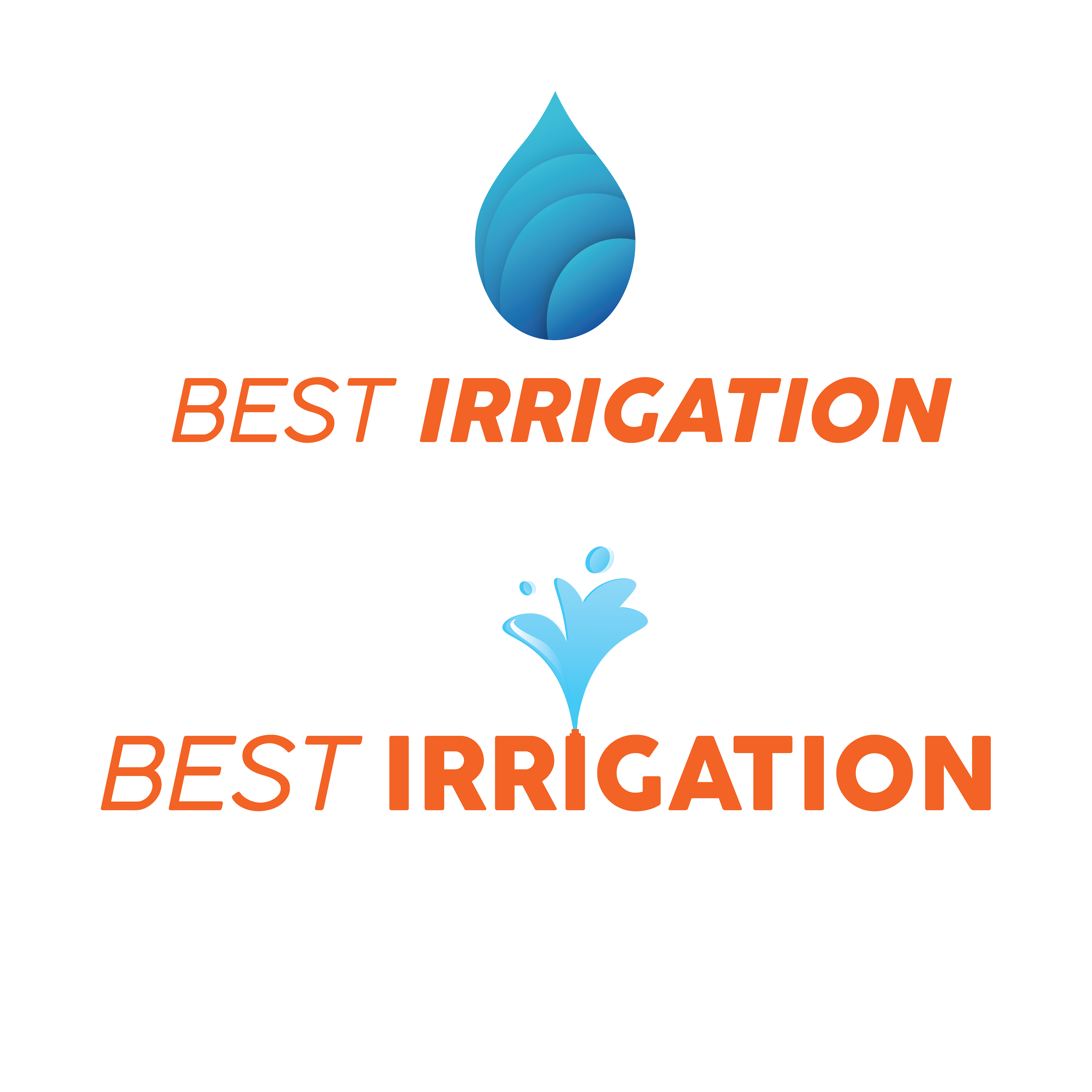
Here are the final iterations of the logo that were designed.


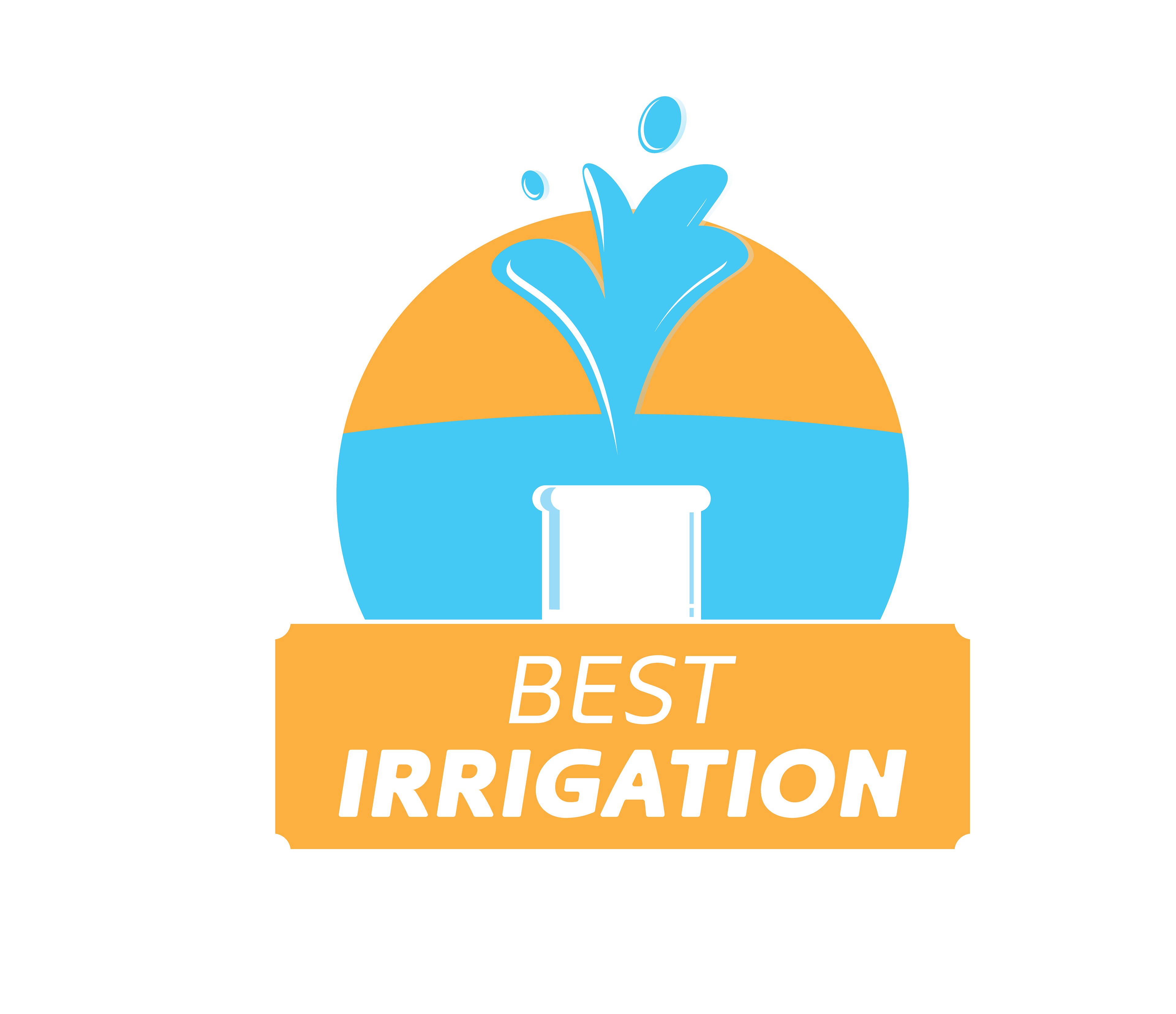
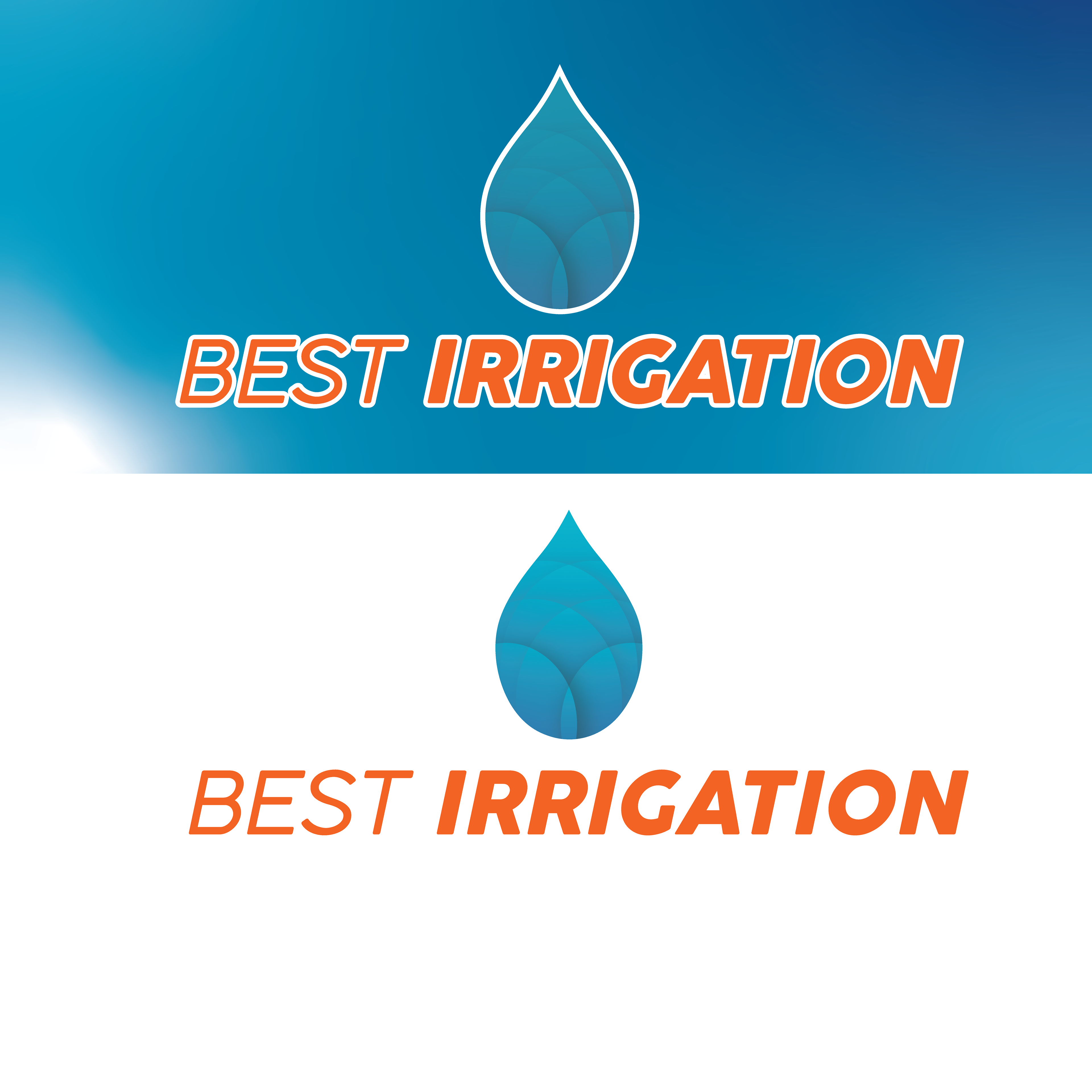
Here is the second to last draft of the logo. It ended up having a weight that was a bit too heavy on the "irrigation text". I was also encouraged to explore different patterns within the water drop, which led me to design the final lawn pattern.
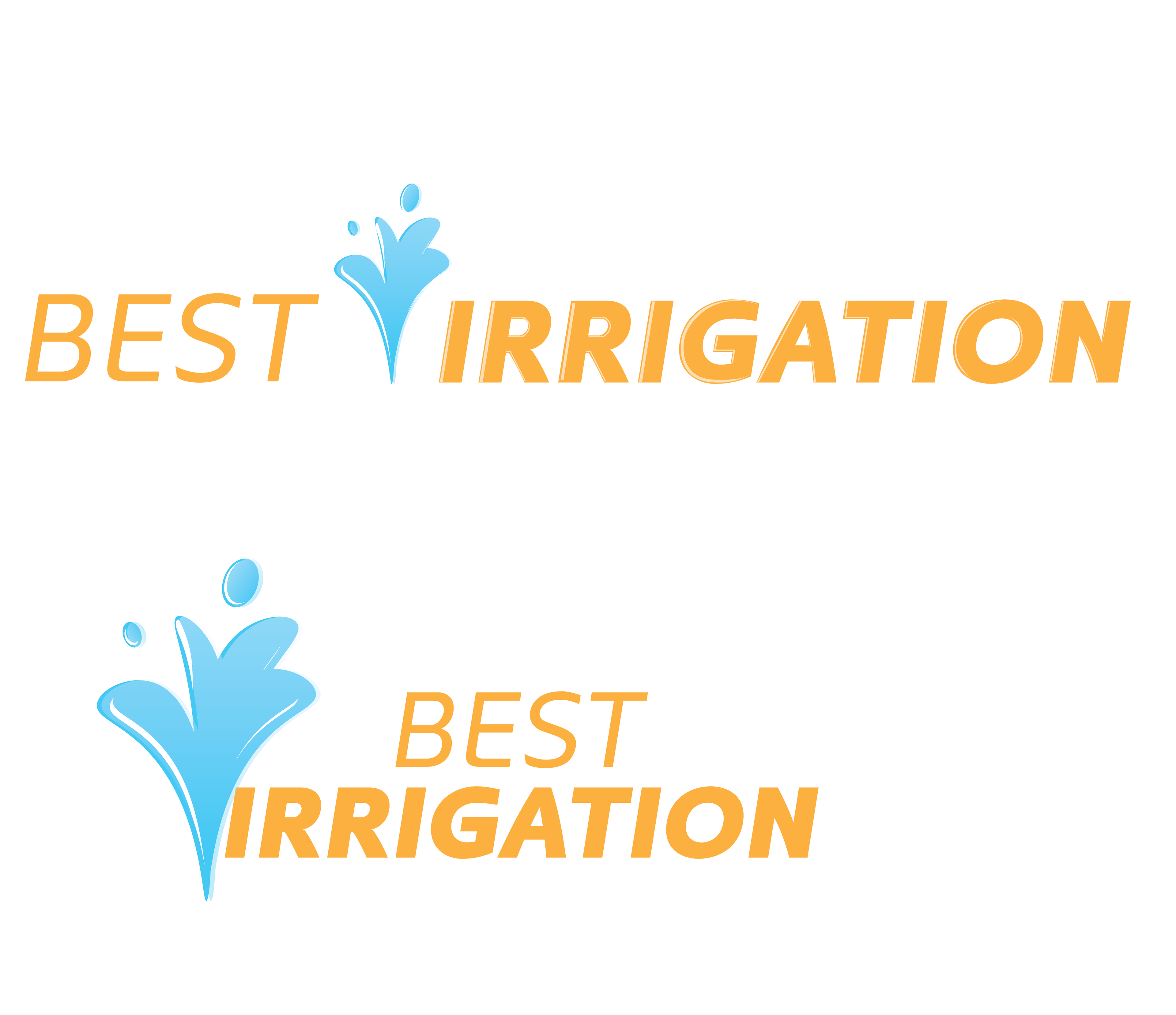
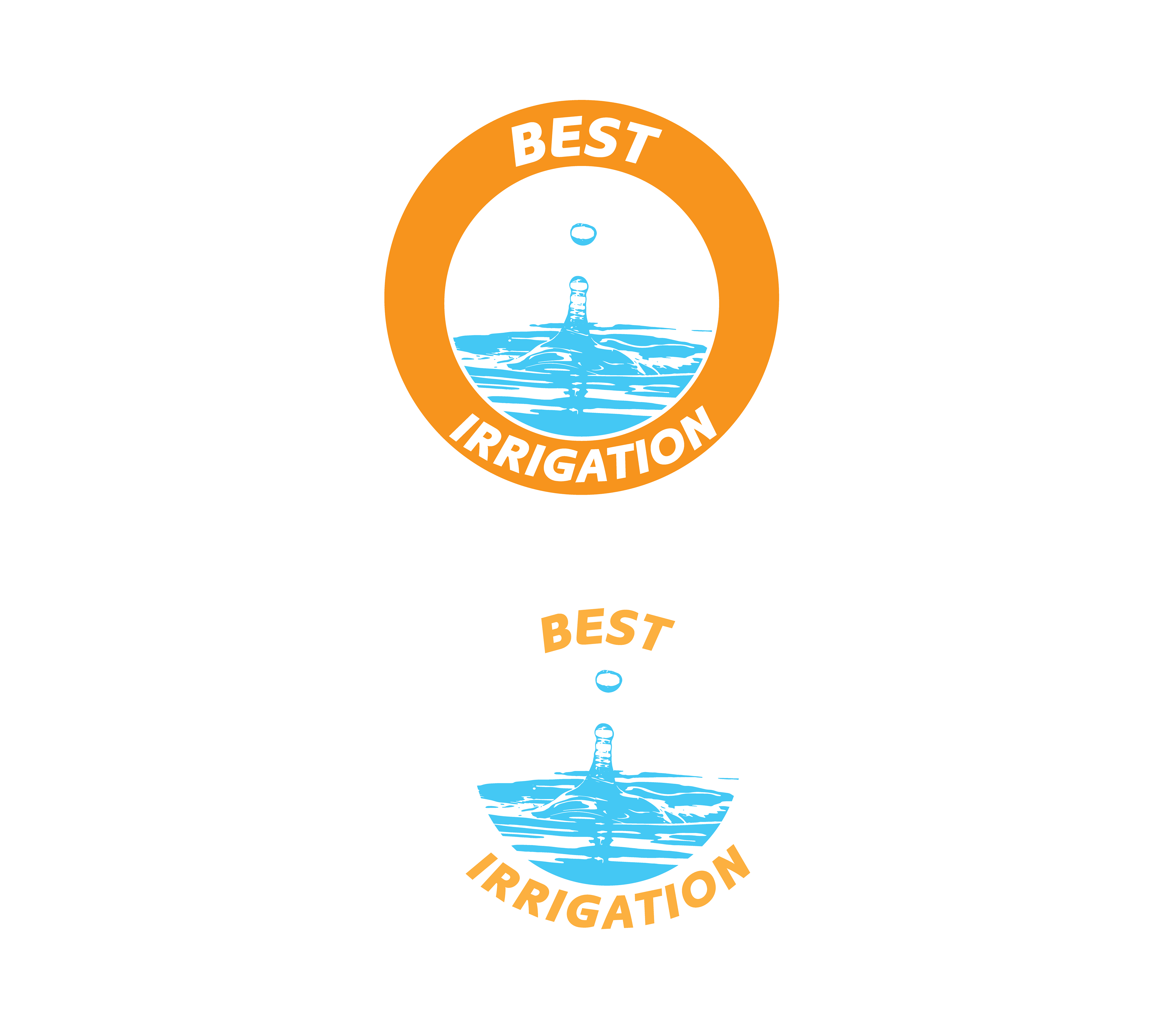
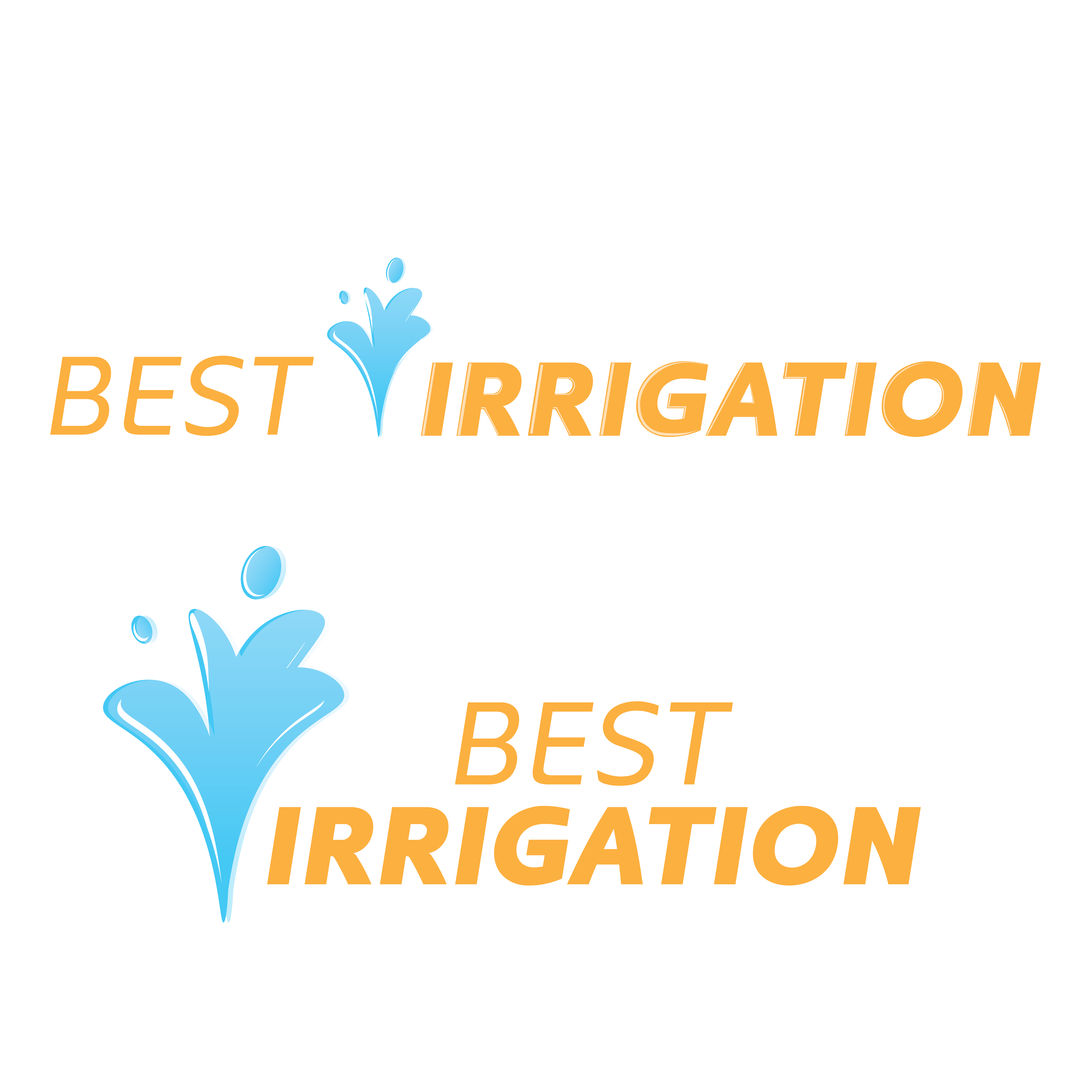

These are all my first drafts of the logo. These were done simply to explore different possibilities with the company name and general direction of the logo in mind.